Barnes & Noble Redesign
More Than a Bookstore

Overview
Driven by a deep appreciation for Barnes & Noble, I expanded upon a school rebranding project, refining both the app's digital experience and the in-store experience to better position the brand in today's evolving market.
Product
Barnes & Noble Rebrand
Barnes & Noble Mobile App
Timeline
2 Months
My Role
UI Designer
Visual designer
Brand Designer
Prototyper
Skills
User Research
User Testing
Wireframing
Interactive Prototyping
App Auditing
Illustration
Competitive Analysis
UI Design
Logo Design
Tools
Figma
Procreate
Adobe Illustrator
Problem
"It feels so different from the Barnes & Noble I use to know"
Barnes & Noble, a beloved cornerstone of the literary community, faces a critical challenge in today's rapidly evolving market. The shift towards convenience and value, driven by the rise of e-book sales and online book retailers, has necessitated significant adjustments for brick-and-mortar stores like Barnes & Noble. While the brand has made efforts to adapt, these changes have inadvertently impacted the perception of its long-standing patrons, with many feeling the brand is "straying from what it used to be".
Key Issues
NOSTALGIA VS. MODERNITY
The new visual identity, differing from the iconic original, has prompted audience discussions regarding preference to before the brand changes.
DISJOINTED ONLINE EXPERIENCE
Feedback indicates user frustration with the app and desktop interfaces, with many expressing a sense of disconnect and a feeling that the digital experience does not align with the in-store environment.
DESIRED BRAND EXPERIENCE INCONSISTENCY
Users express a desire for greater consistency between the online and in-store experiences.
Goal
Strategically realign Barnes & Noble's in-store and digital experiences by refreshing the brand to unify its modern visual identity with its renowned nostalgic brand perception, appealing to both current and new users.
Research
User Research
To identify critical usability and performance issues of the app, I analyzed over 1,400 user reviews from Barnes & Noble’s app store. The results ended up revealing:
LOW PERFORMANCE ISSUES
App performance issues, like slow loading and crashes, often leading users to abandon the app for the website or to abandon both all together.
SEARCH & BROWSING ISSUES
Users find book discovery challenging due to search inefficiencies and cluttered results, impacting the browsing experience.
CHECKOUT/CART/PAYMENT ISSUES
Checkout errors and usability problems, including payment and un-controlled purchases, caused frequent cart abandonment by users.
LOW FUNCTIONALITY
Missing essential features like deals and digital purchases limited app functionality and didn't align
with user expectations.
Key Findings
Competitive Analysis
Key Findings
My Competitive analysis revealed competitors like Amazon and independent online booksellers excelled in personalized recommendations, robust digital content offerings, and streamlined purchasing.
While Barnes & Noble's in-store experience still remains a strength, its digital presence lags, particularly in app functionality and cohesive brand integration.This suggests that Barnes & Noble must prioritize enhancing its digital experience and bridging the gap between its online and physical offerings.
Market Trends
Key Findings
The book market is increasingly driven by convenience, digital content, and competitive pricing.
While price sensitivity necessitates competitive offerings, Barnes & Noble must address these trends by enhancing its digital platforms, expanding digital content, and strategically pricing Their content to remain competitive against online retailers.
Visual Identity


App Redesign
Ideation Process
App Audit
conducted an app audit to better understand the current design and layout of the app and made annotation along while studying each screen.

Information Architecture
Created an information architecture that modeled the app then created a refined one that adjusted some noticeable holes in the previous.

IA (iteration one )

IA (Revised)
Wireframing
Building upon initial research and the Information architecture, I developed mid-fidelity iterations of screen layouts.

A/B User Testing
To address user pain points and validate design decisions, A/B testing was conducted on key areas of the app, Including:
ACCOUNT CREATION & LOGIN
Comparing the usability of the redesigned sign-in, account creation, and biometric login options against the original versions.
GENRE FILTERING
Evaluating the effectiveness of the new genre filtering system compared to the previous iteration.
Key Findings
This unmonitored A/B testing provided valuable insights into user preferences and behaviors, confirming the positive impact of the design changes on user experience.
EASY FILTERING
Users overwhelmingly preferred the new app's filters, specifically the genre filter.
TASK COMPLETION
The new design achieved a 100% task completion rate.
POSITIVE UI FEEDBACK
Users praised the new product's UI, describing it as "clean" and "easy to scan".
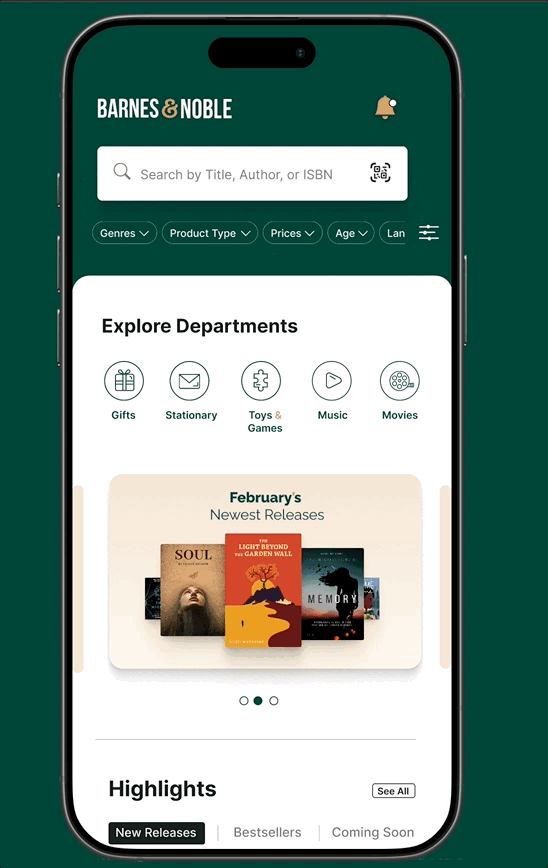
Final App Redesign
Rebranding
Solution
"Bookmark Moments"
Based on my research, I redesigned Barnes & Noble's brand to better align with its core values of welcoming environment. The new visual identity blends modern aesthetics with subtle nostalgic elements, that is both sophisticated and inviting.
TARGET AUDIENCE
Book lovers who are looking to for a sense of community and discovery
CORE VALUES
prioritizes customer satisfaction and strives to create a welcoming and helpful environment for all.
BRAND PERSONALITY
The new brand personality strikes a balance between clean, modern aesthetics and inviting elements that celebrate the joy of literature and storytelling.


.jpg)
Key Decisions
For the final design, I created high-fidelity designs that addressed key user pain points through visual clarity, intuitive navigation, and brand consistency, ensuring an accessible and engaging user experience.
ORGANIZED FILTERS
Implemented a comprehensive filtering system, allowing users to refine their searches by genre, author, availability (in-store/online), and sales items, improved book discoverability and streamlined the browsing experience.
CREATING ACCOUNT/SIGN-IN ACCESSIBILITY
Introduced biometric login options to account screen (e.g., fingerprint, facial recognition) and a simplified password retrieval process. This enhanced security and provided a more convenient login experience
CART AND CHECKOUT EXPERIENCE
Redesigned the cart and checkout flow to be more intuitive and user-friendly. This included simplified item management, streamlined gift card and coupon application, and clear payment options, reducing friction and encouraging purchase completion.

